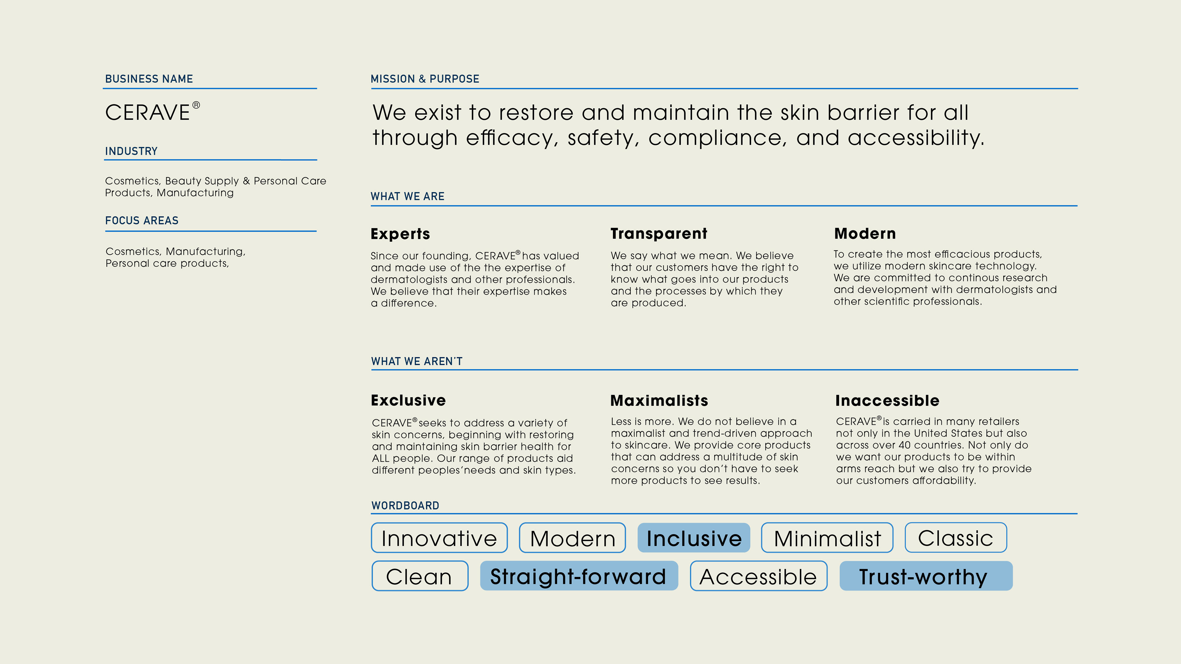
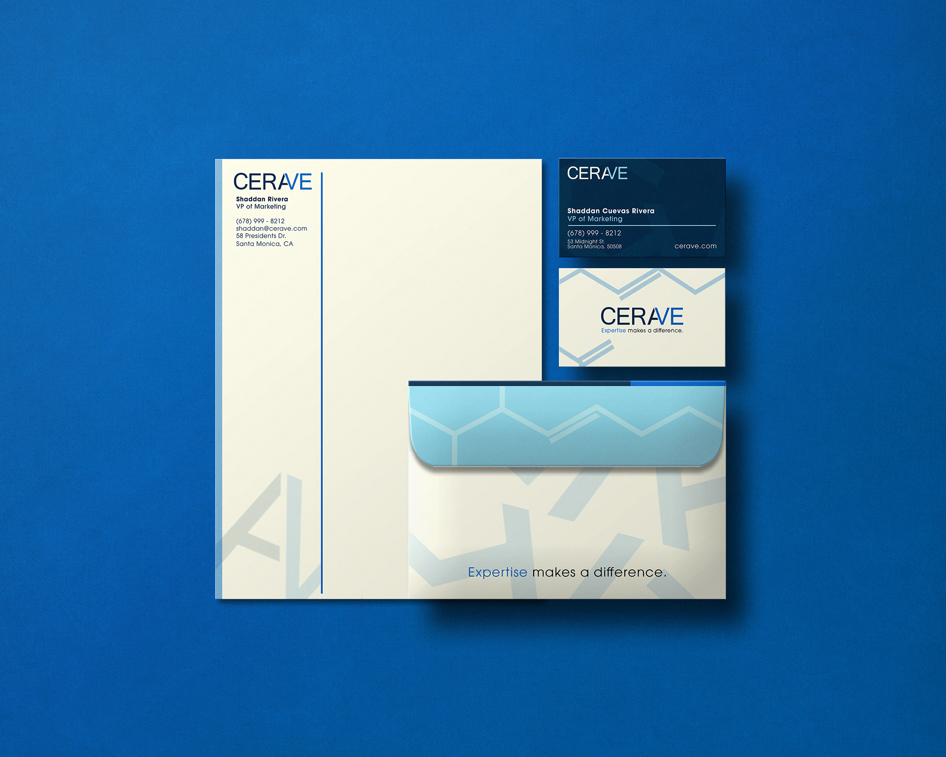
The Rebrand
CeraVe has earned trust by tackling skincare with an approachable, no-frills ethos, yet as Harper’s Bazaar notes, the brand remains "aesthetically unremarkable." This rebrand bridges that gap, elevating its visual identity to feel timeless and modern while preserving its utilitarian roots. The result? A design that’s distinctly memorable yet unmistakably CeraVe: simple, expert-backed, and quietly confident.
Timeframe: 2.5 - 3 months
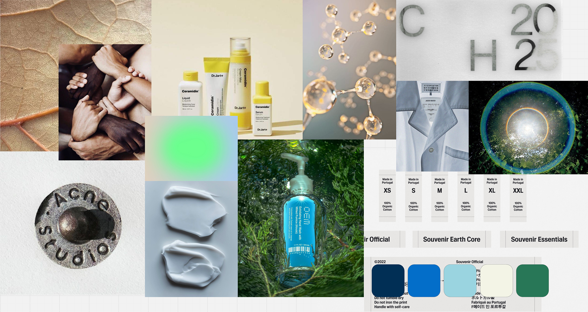
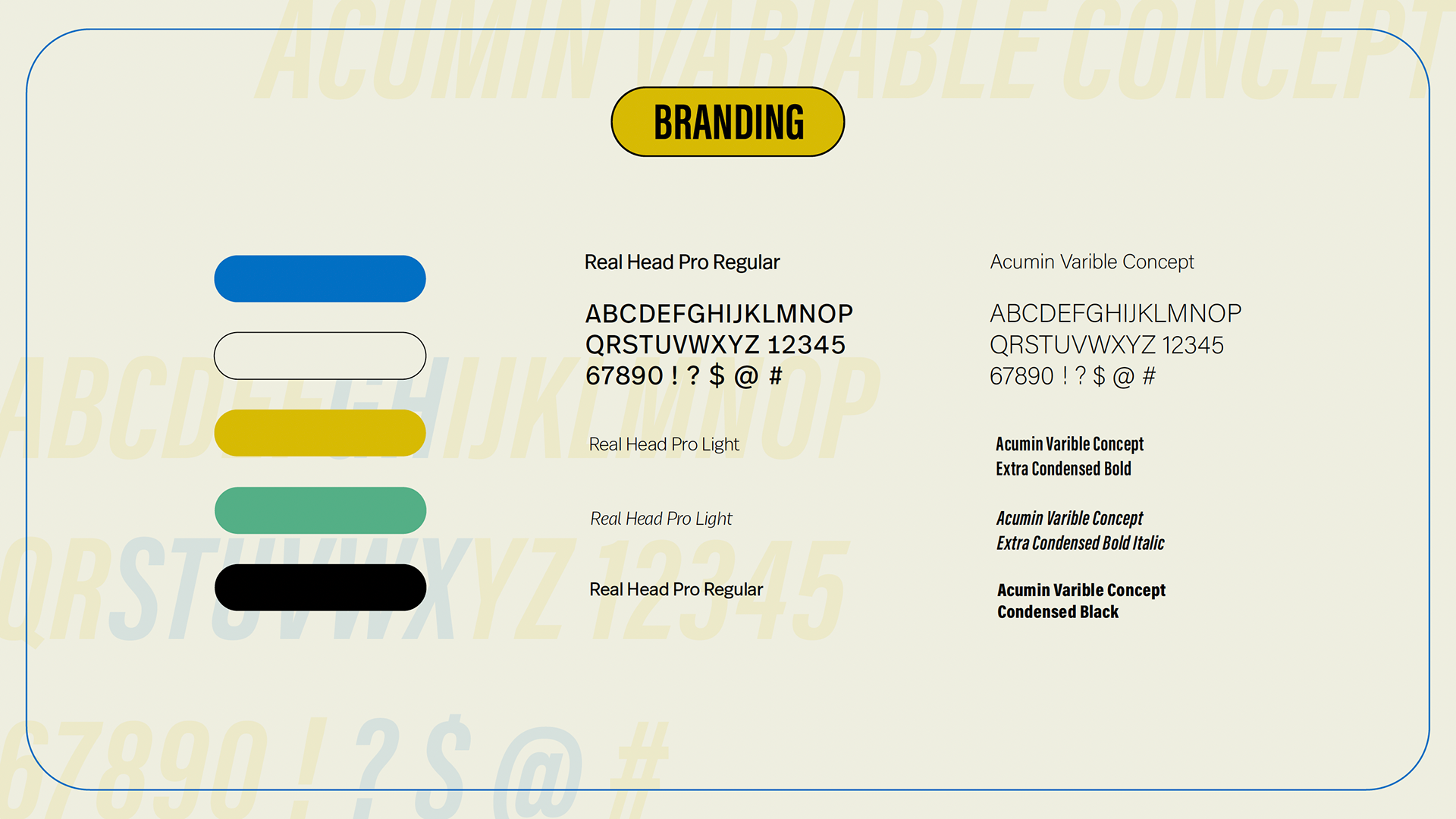
Moodboard
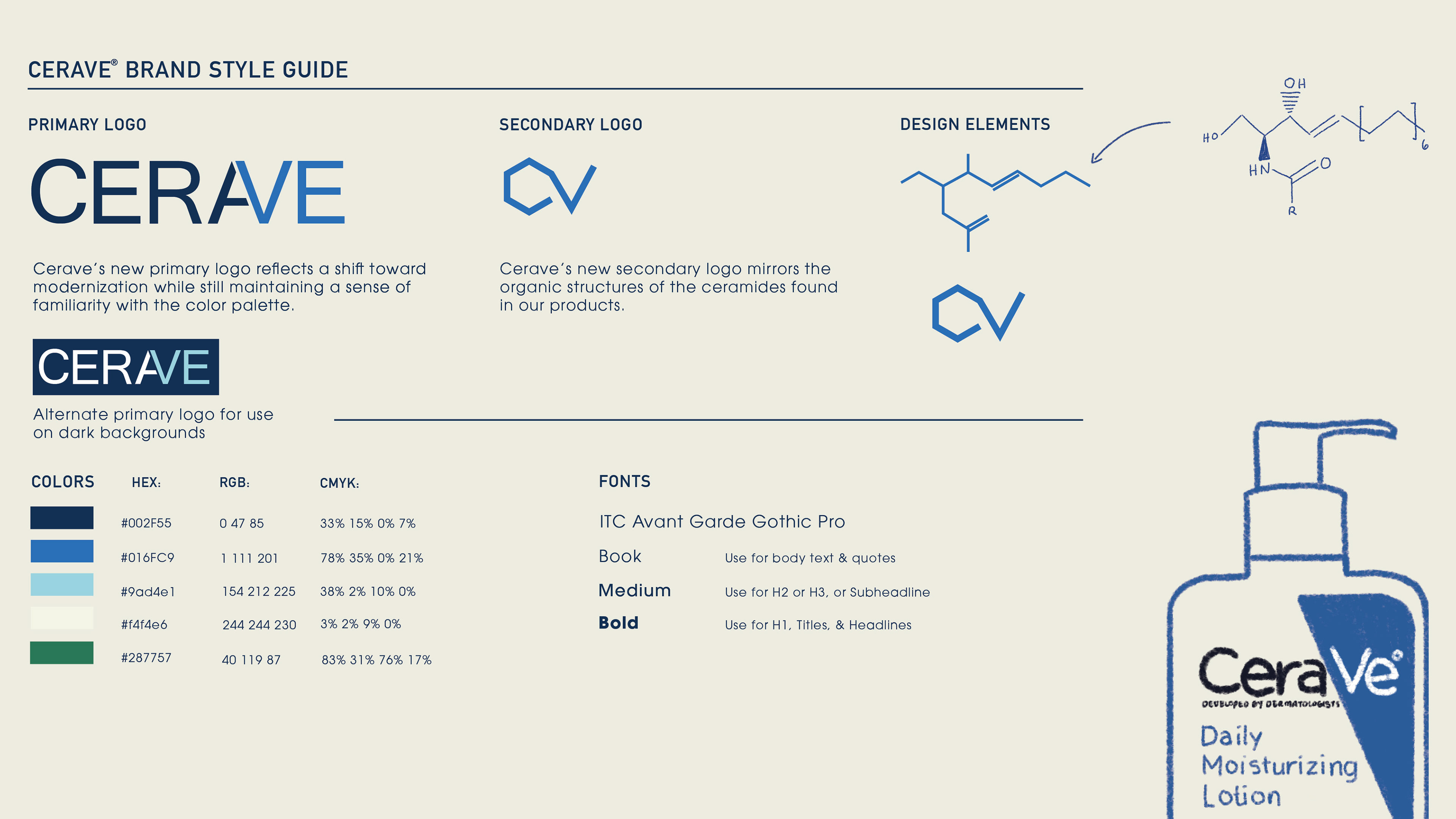
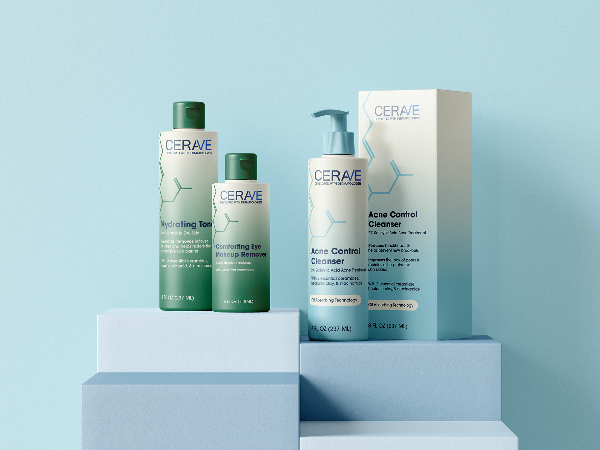
Ceramides are a part of not only the CeraVe name but also their products, so I simplified its structure and used it as a design element. This would replace the triangle at the corner of some of their packaging
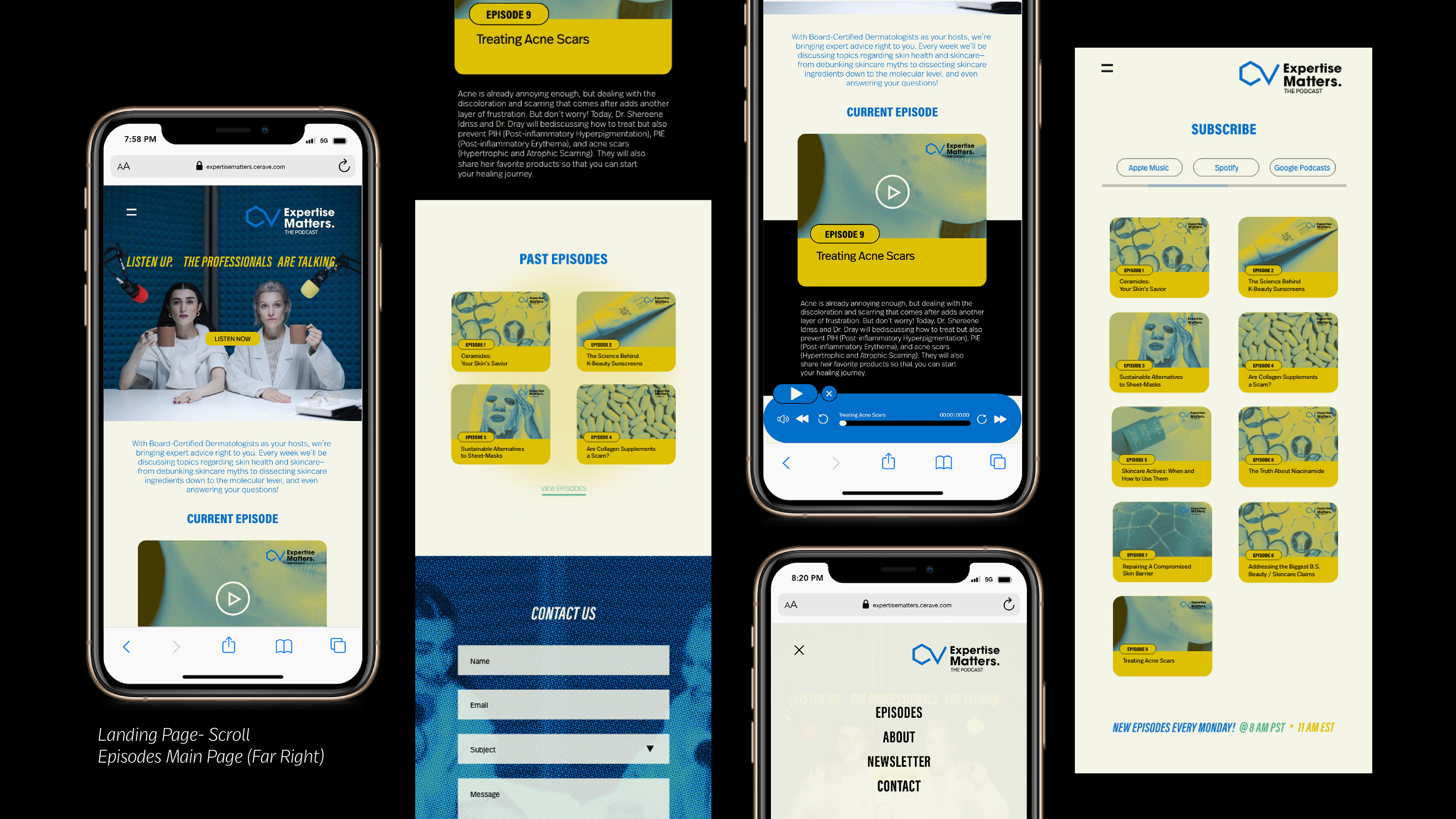
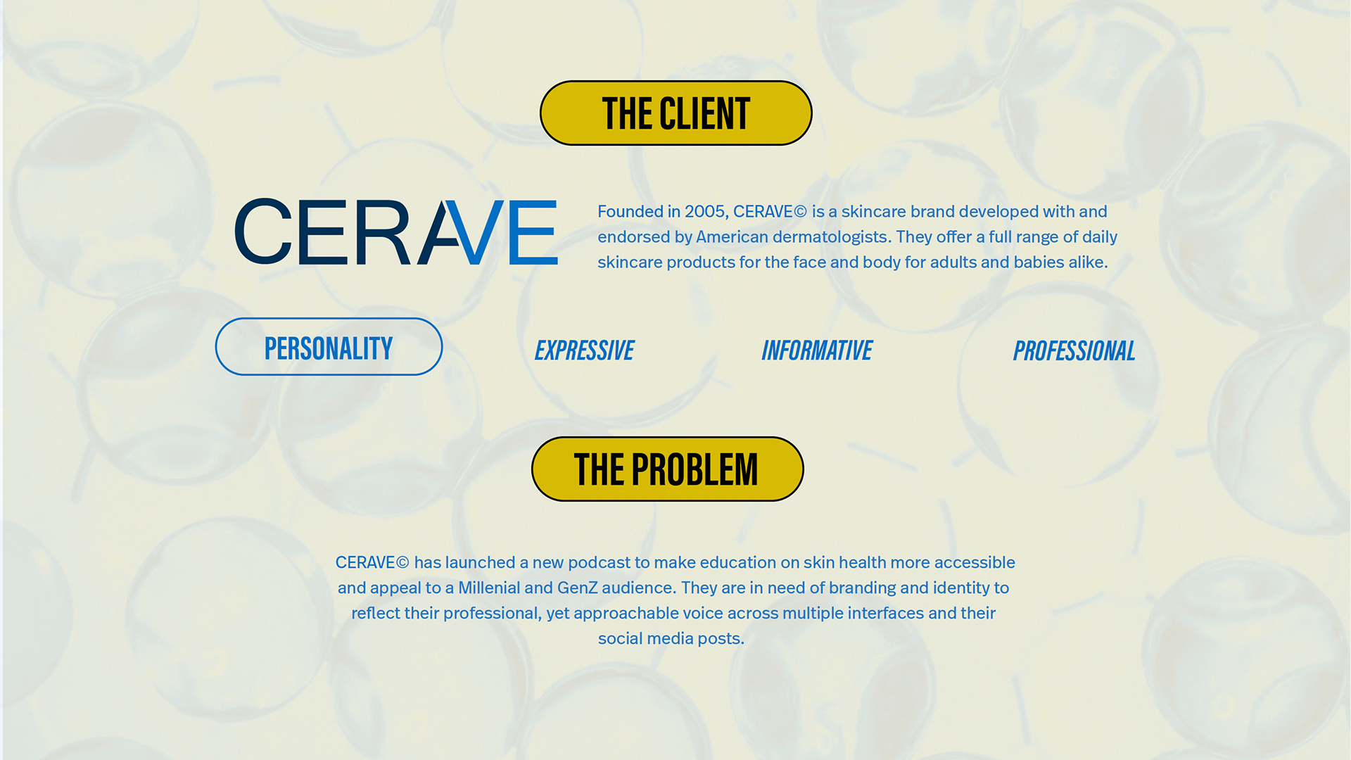
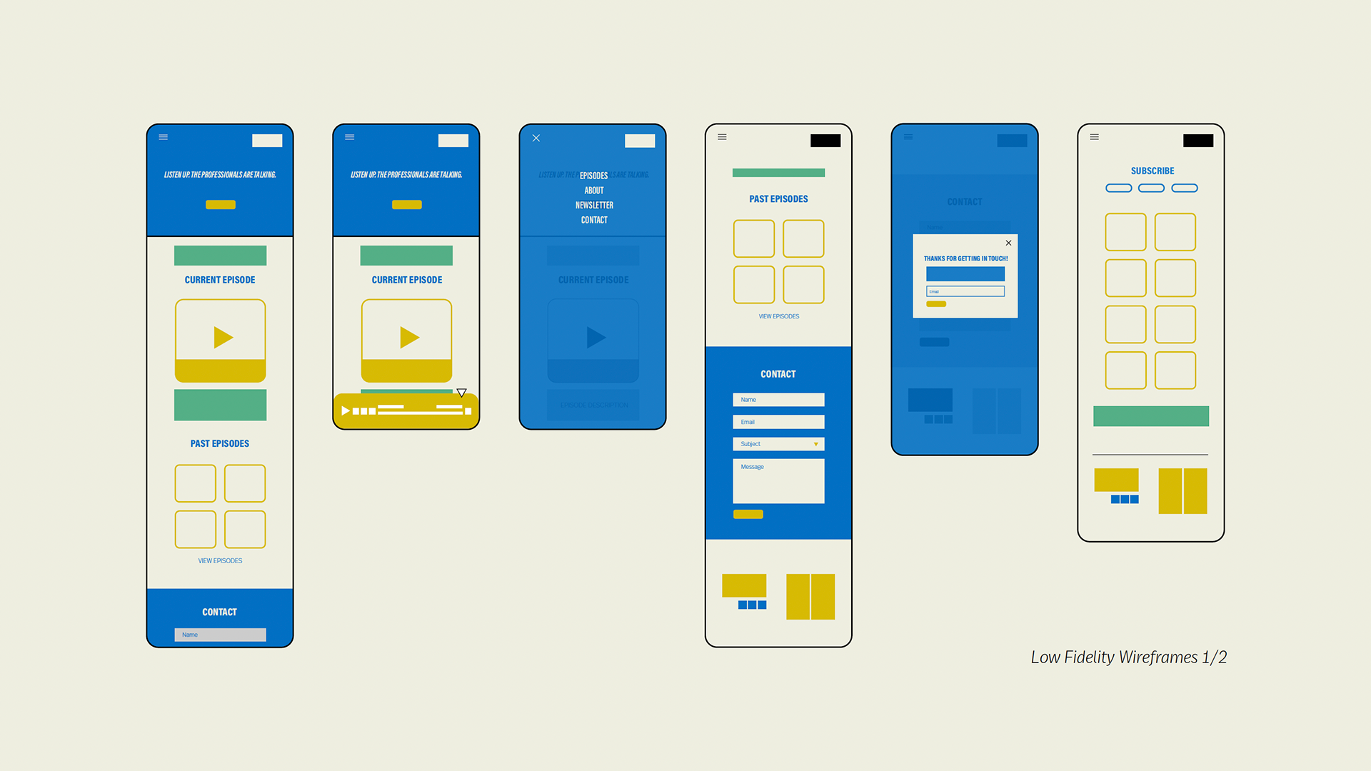
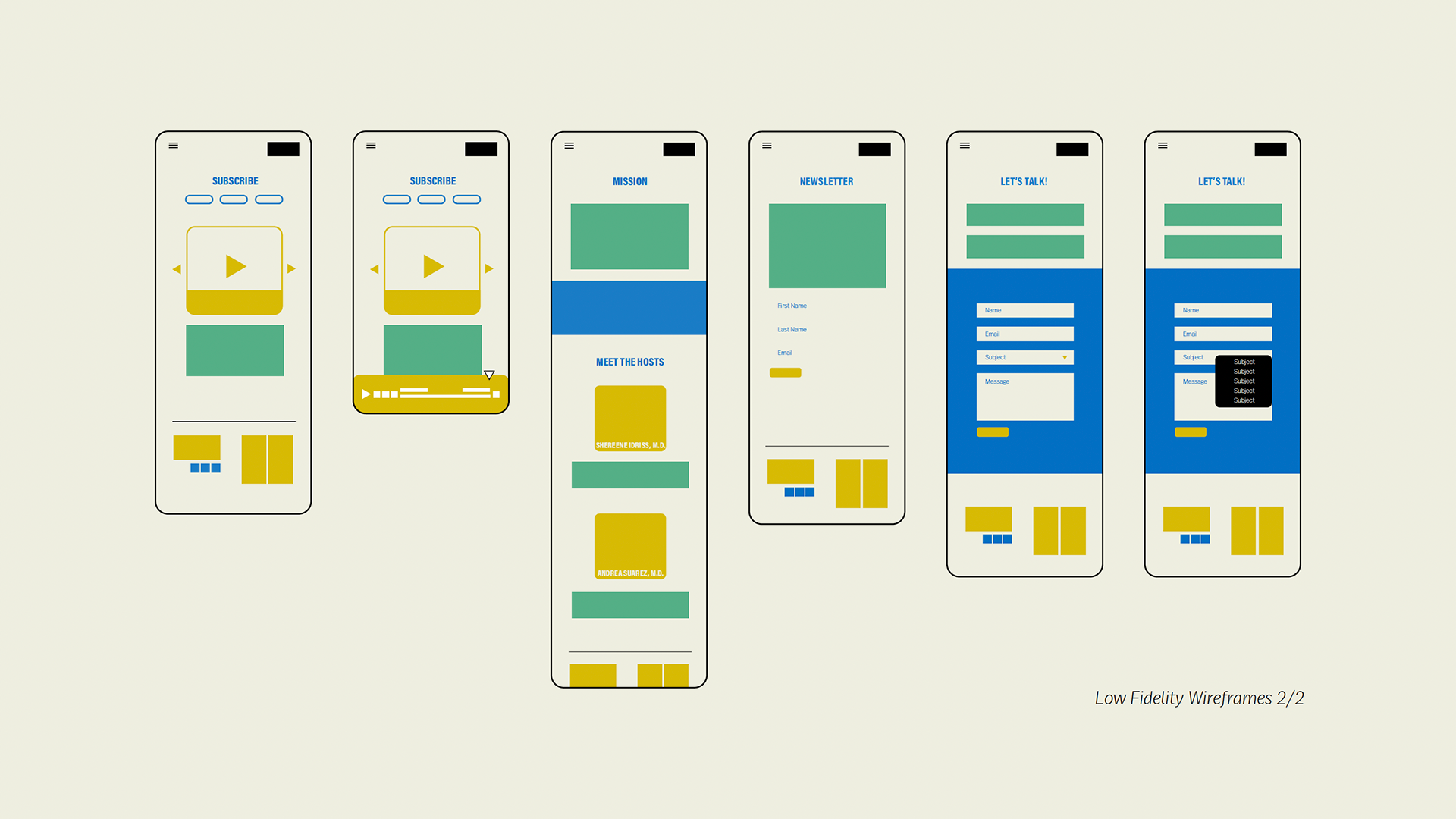
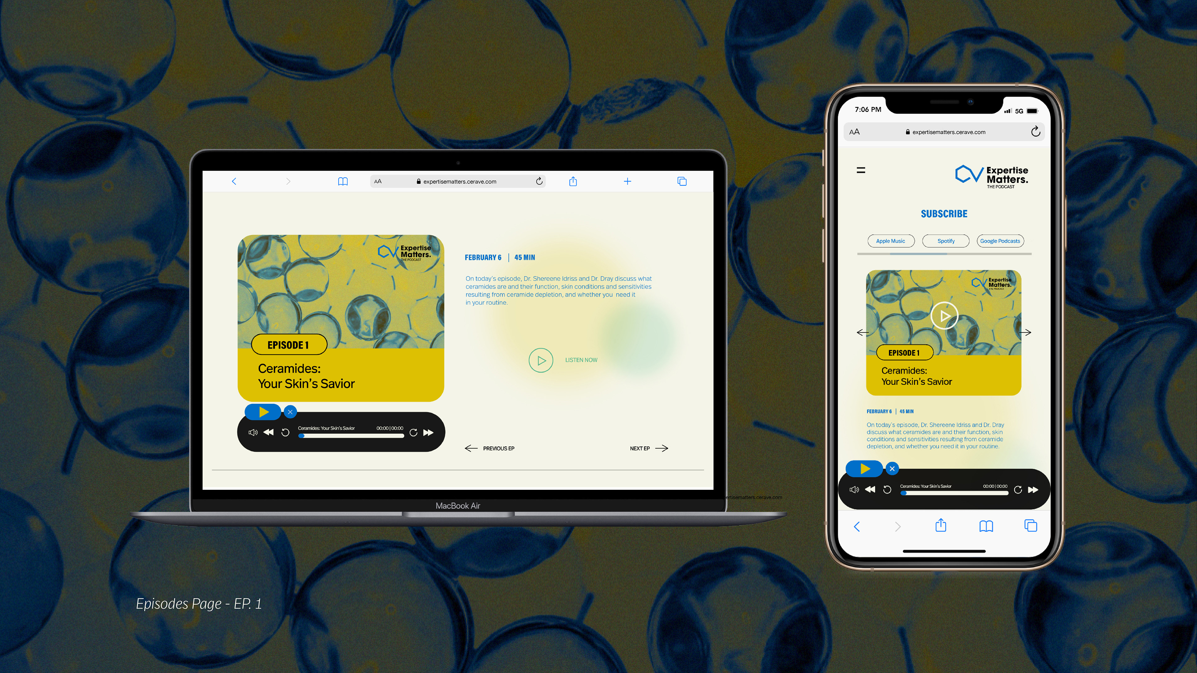
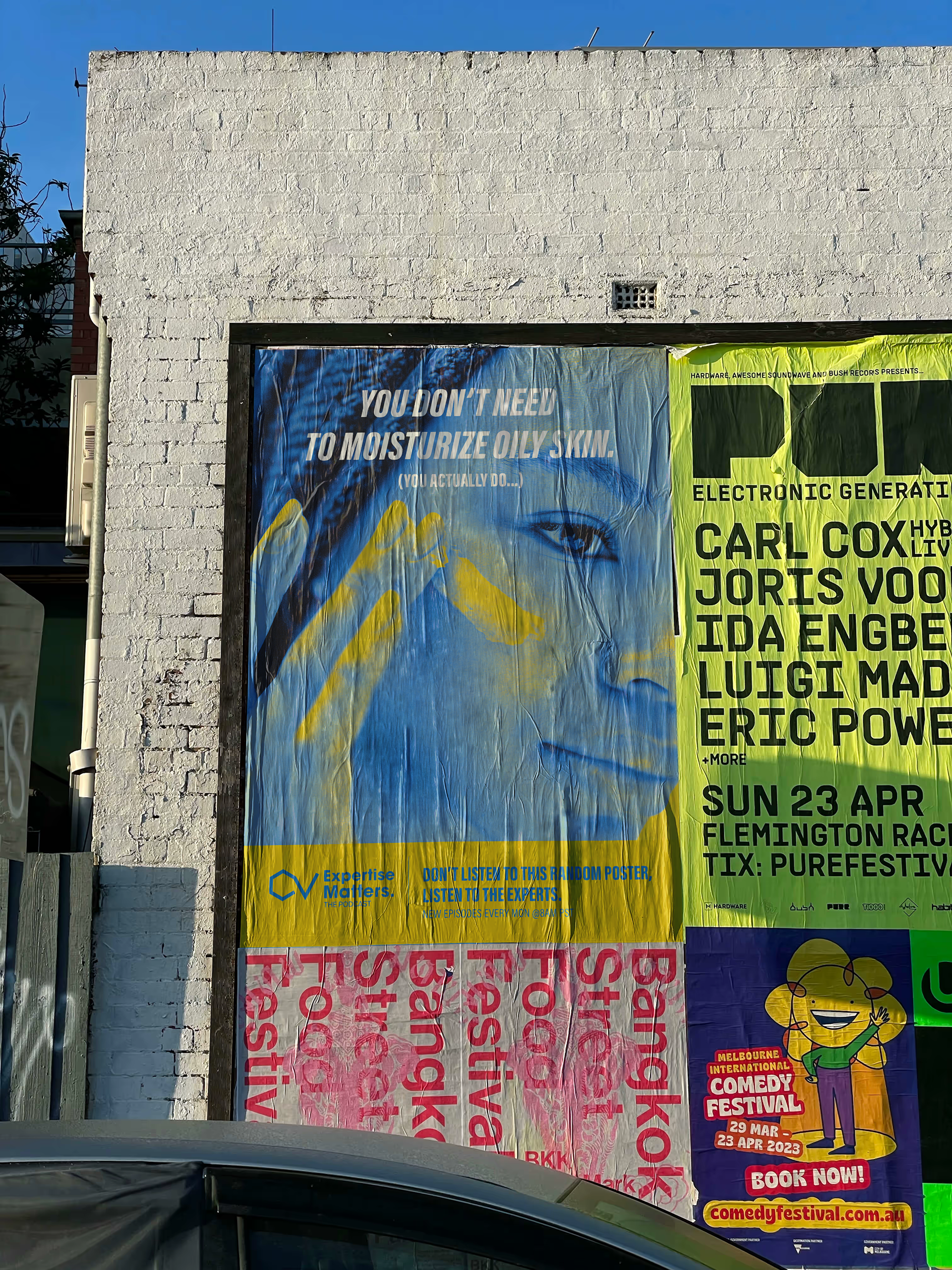
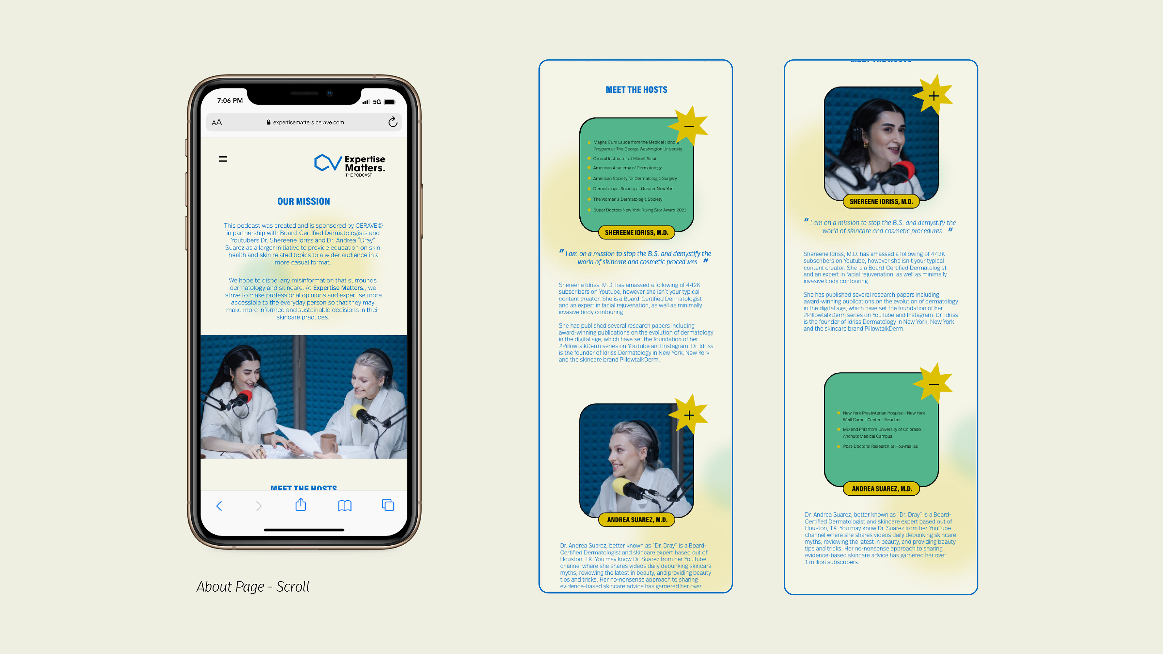
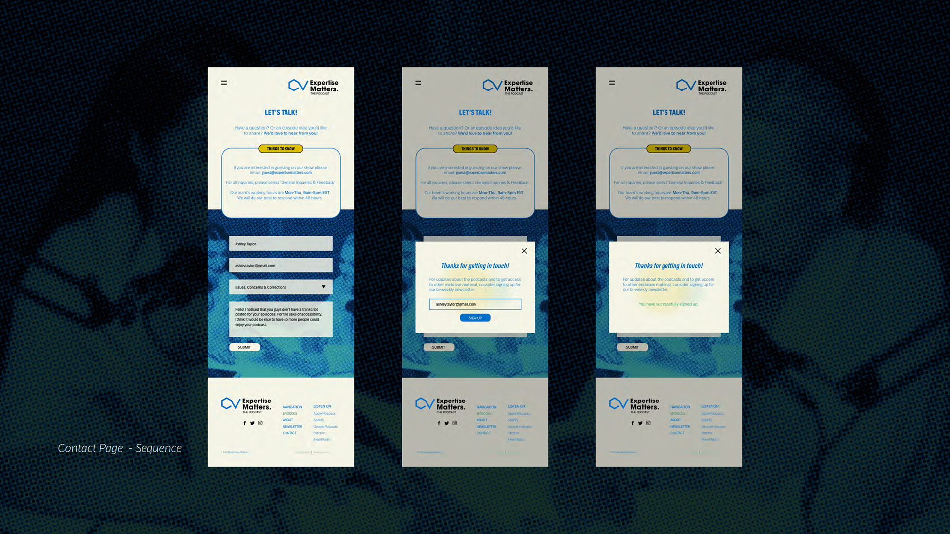
Expertise Matters: The Podcast
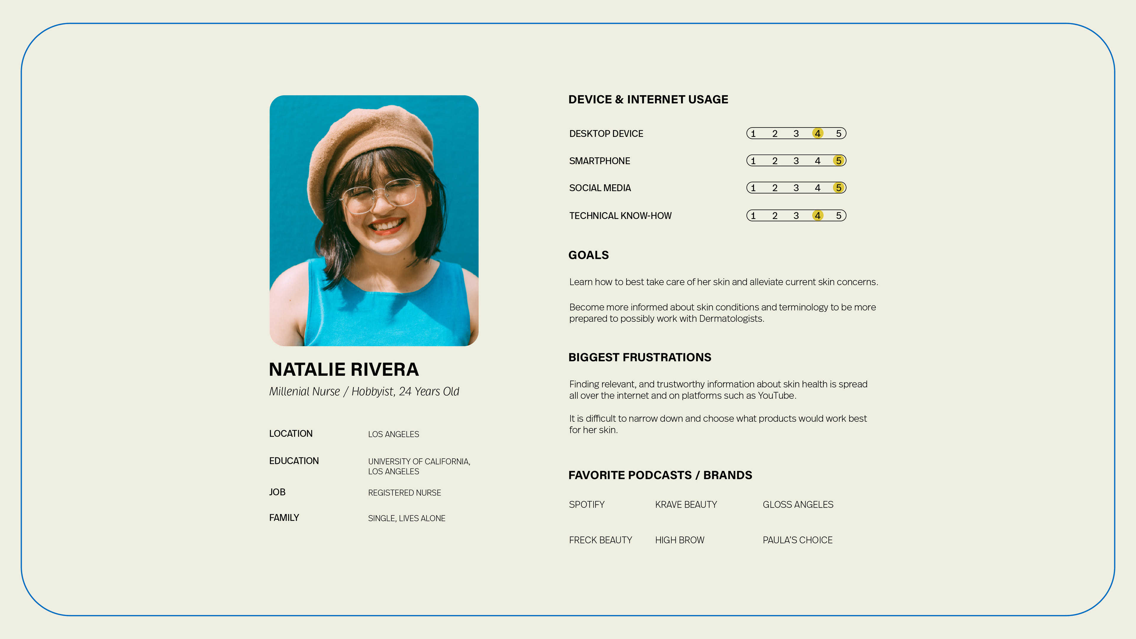
This project builds on the previous CeraVe rebrand that targets a Millenial and GenZ demographic. This podcast site seeks to expand CeraVe’s presence in a niche of media that many Gen Zers consume.
The purpose of this website is to inform and encourage engagement with the CeraVe brand in a more modern and trendy way. It would also allow the brand to tangibly exercise their brand appeal and values: they are made by and endorsed by experts.